 |
 |
 |
| VA Medical Center - Bay Pines, Florida |
| By Peter Van Allen, SEGD |
| What is the first impression visitors have of your medical facility? More than likely, it has something to do with an exterior characteristic they encounter on their approach. The architecture and landscape for each VA is unique, often times encompassing the period in which it was built or the local design flair. Such is the case at the VA Bay Pines, Florida, with its traditional Spanish Renaissance style. An historic cupola atop the post office adds an element that is a distinctive landmark. Encompassing this feature, from the exterior into the interior signage program, was one of the first decisions made to give visitors a continuing sense of style and design from their arrival to the final interior destination. |
| Stephen Ledesma, VA Interior Designer, felt strongly that his signage program should be specifically designed to suit the Bay Pines facility. At his behest, Creative created a new “branding” in the form of a dedicated campus logo. The logo is based on the distinctive cupola atop the post office building with blended elements of palm fronds and gulls. This new logo has been accepted as a “floating watermark” on many of the signs and will be used for other PR collateral. |
 |
| Upon entering the interior of the main hospital building - a large footprint with parallel corridors that lead to multiple destinations – one encounters a maze of confusing intersections. It presents a challenge even for a finely tuned signage system. The existing system was simply not able to keep up with the VA’s needs. Many signs were homemade in an effort to deal with the constant changes that a medical facility endures. Some signs had too much copy, some too little – and none were updateable. |
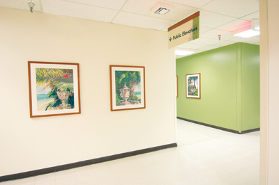
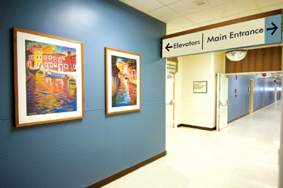
| Among a variety of options to deal with the interior wayfinding challenges, it was decided to again look to the facility itself for a specific answer - by utilizing the interior color palette. Signage complemented with a band of the color that coordinates with the hall colors aids patients and visitors in identifying their location. For example, the green radiology hallway is reflected in the radiology area signage with a green band. The Bay Pines VA Logo coupled with Mr. Ledesma’s hallway color-coding results in a signage system that is both functional and elegant and has been accepted with wide acclaim by management and patients alike. |
| Additionally, a new art program offers clear landmarks that coincide with the color choices by offering visitors and patients one more method of identifying where they are located. Selected frames match the wood header panels of the overhead signage while incorporating the hallway color schemes. |
 |
| The next step is continuing into the exterior signage program. This system pays homage to the traditional Spanish Renaissance revival architecture that is the hallmark of the campus. The signage utilizes gentle curves with ivory and terra cotta accents that reflect the palette of the many ornate and tiled buildings. Due to the myriad of roadways and decision points, directional components are being carefully scrutinized to easily guide the patients and visitors without creating a visual overload. When completed, the campus signage master-plan will incorporate wayfinding, identity, regulatory and traffic control devices in a comprehensive system. |
Home : Products : Design Process : Portfolio : Image Gallery : Resources : Services : Client Login : Contact Us